

DRZERO Neology Shampoo
DRZERO ネオロジー シャンプー
強さと洗練の両立
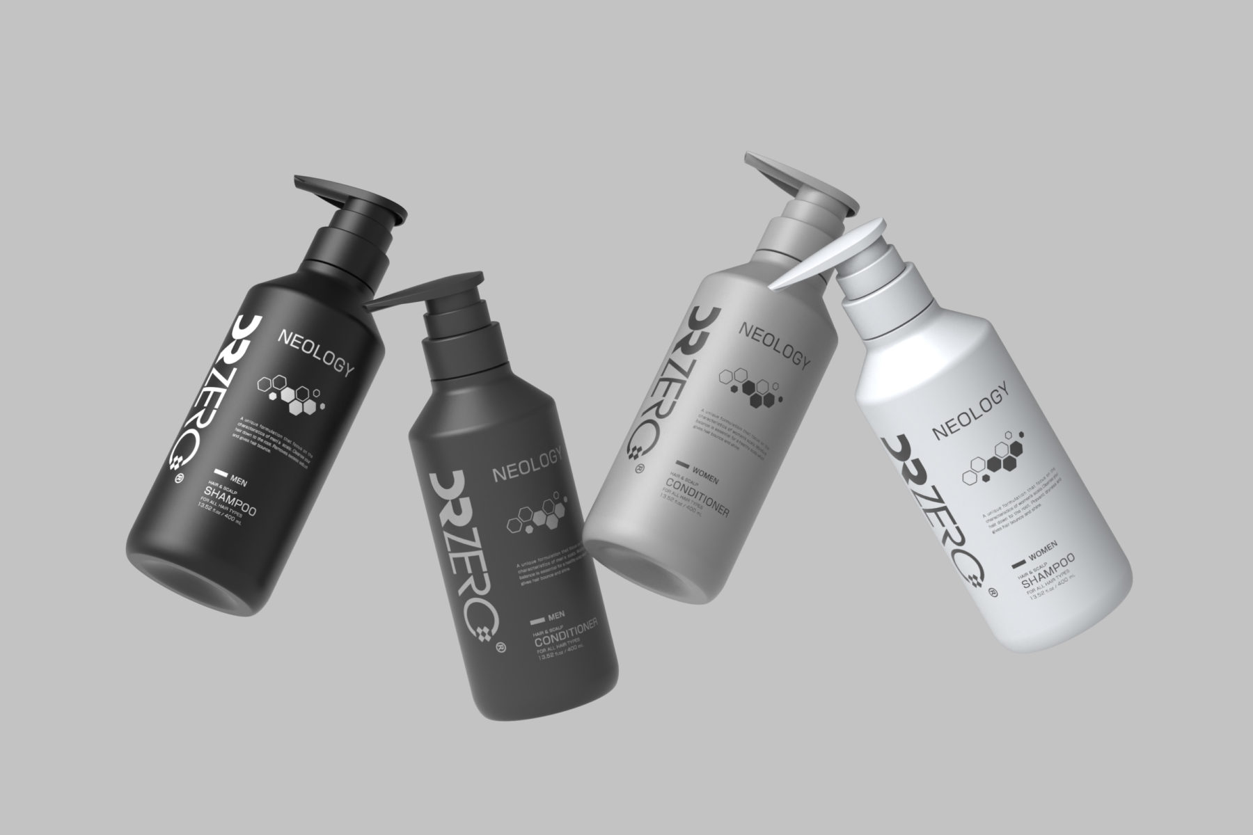
自信と知性、洗練さを兼ね備えた製品イメージを目指しました。DRZEROのロゴを大胆に配置することで、ブランドの自信と力強さを印象づけています。一方、シンプルで理性的なフォルムと無彩色のカラーリングにより、科学に裏付けられた信頼感を表現しています。
理性と柔らかさの調和
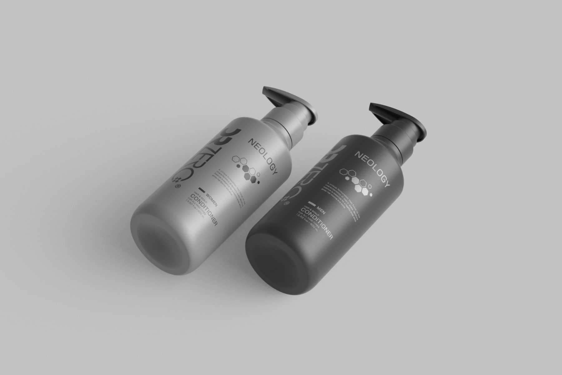
明快な幾何学的ラインを用いた直線的でシンプルなフォルムとし、科学的な合理性と論理性を表現しました。ディスペンサー上部には緩やかな曲線を取り入れ、全体の印象に柔らかさを加えることで、機能性と洗練された佇まいの調和を図っています。
調和を生むグラデーション
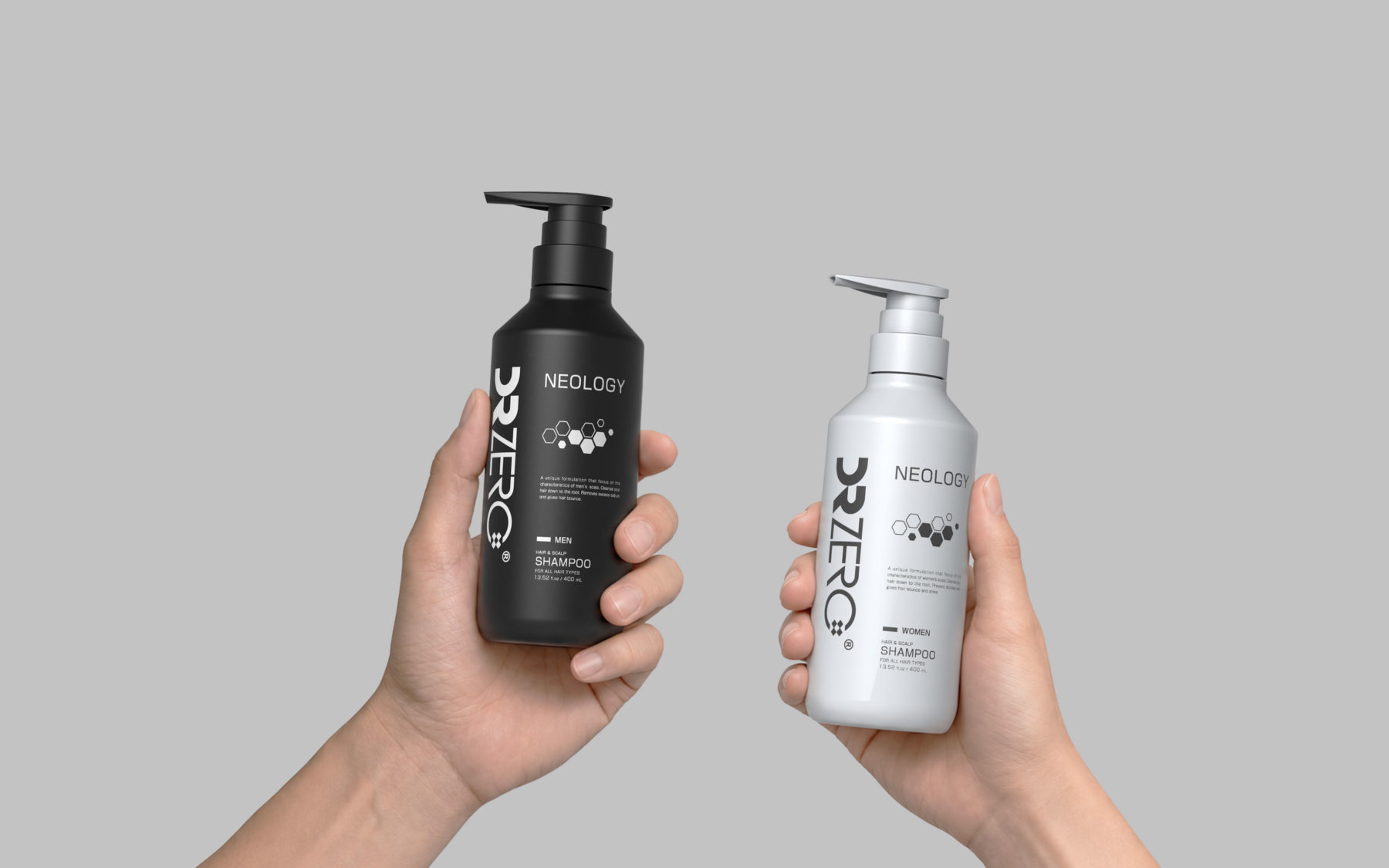
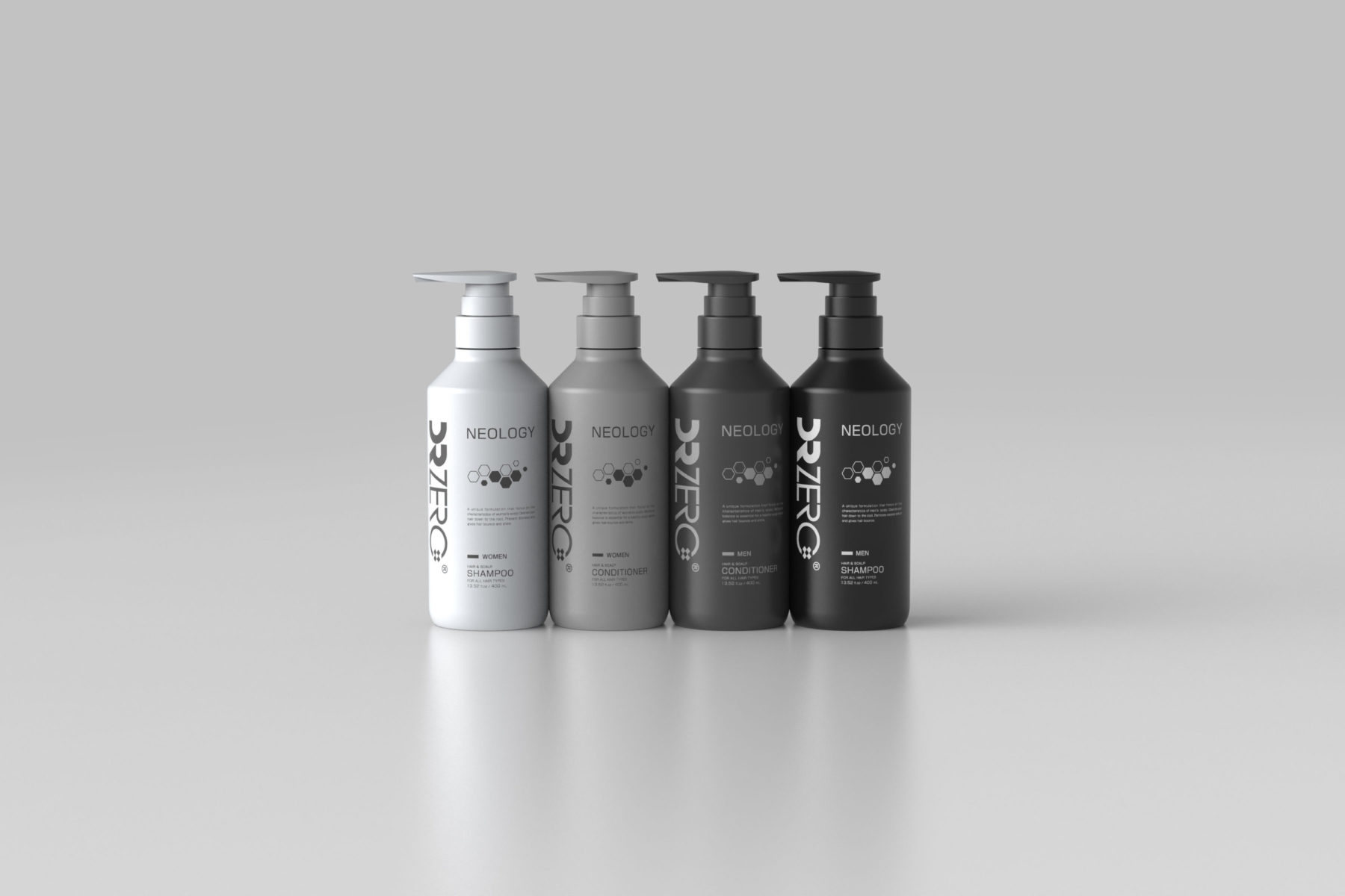
男性用シャンプーには、髪の深みや力強さを想起させるブラックを採用。一方、女性用シャンプーには、明るさや清潔感、健やかな髪の美しさを想起させるホワイトを採用しました。ホワイトからライトグレー、ダークグレー、ブラックへと連続するグラデーションを形成し、それぞれの製品の個性を際立たせながら、並べた際には統一感のある、印象的なブランドイメージを生み出します。
Strong Yet Refined
Combining a strong visual presence with a restrained design language, creating an identity that conveys confidence, intelligence, and refinement. The DRZERO logo establishes a bold and confident brand image. Meanwhile, the clean, rational form and achromatic color palette evoke a sense of trust associated with science.
Balancing Logic and Softness
The bottle features a clean, straights silhouette that employs clear geometric lines to express scientific rationality and logic. A subtle curve at the top of the dispenser introduces softness to the overall form, creating harmony between functionality and refinement.
Gradation of Harmony
The bottles form a continuous gradient from white throught light grey and dark grey to black. Black represent men’s shampoo, evoking the depth and strenght of dark hair; White convey brightness, cleanliness and beauty of healthy-looking hair. Each product maintains its distinct identity, while the lineup forms a conhensive and recognizable brand expression.
- Year : 2023
- Category : Design Division
- Client : EWI Lab Co., Ltd.
- TREEOW Fogless Pure Humidifier F4
Design Division
|
2025
- Nasal mucus aspirator with hand pump “Sotto Totte”
Design Division
|
2024
- Tomita-style Safety Grater Ⅱ
Design Division
|
2024
- Tomita-style Safety Grater
Design Division
|
2024
- Metal net hammock “floate”.
Design Division
|
2023
- UV-C light air sterilisers ”MEDIUV”
Design Division
|
2023
- High-precision infusion controller with droplet detection ”SEEVOL”
Design Division
|
2022
- Automatic faucet hand wash basin ”AWAMIST”
Design Division
|
2022
- Automatic hand sanitisation dispensers for hotels and public spaces ”PROTEGATE”
Design Division
|
2021
- Nasal Aspirator
Design Division
|
2021
- celtis
Design DivisionMETAPHYS Division
|
2006
- Digital automatic Sphygmomanometer “spot arm HEM-1000”
Design Division
|
2004